Wednesday, August 30, 2006

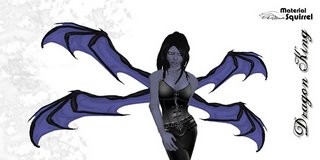
Dragon King Wings


Sometimes I get stuck in a rut and I don't even realize that I'm in one until I try something new.

Several of my customers have requested wings that are 2 prim/one wing on one side. Our wings are a signature style, several feathers on each side. So I've always been reluctant to change that. But I came up with this dragon style texture, it looked AWFUL on the multiple feathers wing shape. So I had to design something new. And wow, it was down right refreshing to do this.

Credits:
All skins: Munchflower Zaius - Nomine
Hair Pic 1: Lost Thereian
Hair Pic 3: ETD
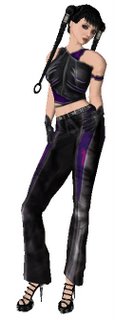
Shirt: Kya Eliot
Pants: Nevermore Studios

Friday, August 25, 2006

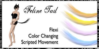
New Fluffy Feline Tail


I actually added this to my store yesterday. I'd planned to blog about it this morning but instead I've been fighting technology all day today. I conquered the problems, but it takes time to figure out why Outlook has deleted an email account and rebuild it in. Then time to answer a week's worth of business email (from my non-SL stuff).

Then I decided to change the template of this blog to make it pretty. That took hours.

But here is the fluffy feline tail. It lashes and swishes. And the nifty color change script so you can match any outfit. And it doesn't look like a cylinder or pipe hanging from your bum.

Available in world at our store (search for Material Squirrel)

SLboutique

SL Exchange

More Design Stuff

A few more things I want to higlight on the design subject:

- Alaska Metropolitan posted a great post on her blog also about this subject. She also took the time to include really good examples. It's always a lot easier to learn with visual aids, so check it out.

- A really good design resource for those you that want to learn more is The Non-Designer's Design Book, Second Edition by Robin Williams. The author has great examples of what NOT to do but also includes very helpful lessons on the elements that do make for good design and how to bring them together. It's a very down to earth book - very straightforward and easy to understand, with pictures.

- Thanks to SL Fashionista & Pixel Pin-up for linking to that blog post. And anyone else who did. My apologies for the typos and grammar mistakes in advance.

Thursday, August 24, 2006

A Quest for Fashion

My biggest concern with the demise of the forums is . . . where am I going to find new designers and cool new places to shop???

Ok, so it's not a huge deal and some might argue that the loss of forums like the scripting/building/design forums is worse as it leaves people without a place to go for help.

But for me, I do 2 things in SL - I create stuff (mostly wings, sometimes clothes) and I buy stuff.

The stuff I buy is mostly clothes, hair, and shoes. Basically, I play a digital version of Barbie dolls - you know, dressing up, combining outfits, hair, shoes. Etc.

I know I'm not the only woman who enjoys SL for the fashion aspect.

The Lindens say that blogs and in world classifieds will replace the classifieds on the forum.

I decided to test the 2nd half of that theory. I search in the classifieds for "new" "new dress" "new clothes " "new flexi" and I went to every place that looked semi-promising. I even went to a few that did not look at all promising.

All I found that was new and exciting, was this killer outfit:Outfit is by Alter Ego Clothing
They have 4 outfits in their store (with different color combinations) and they are all pretty darn cool. There are a few minor details that need work - like the arm bands that don't line up and the top of the shirt that goes across the shoulders (that's a tricky area).

Hair: Kin Keiko
Skin: Munchflower Zaius
Shoes: Galacticaz - really cool shoes but I can't find the name of the maker.

So . . . . the moral is . . . yes, you can find something new. But damn, that's a lot of work. I hope blogs DO fill the gap. Or this girl won't really spend much money in SL.

Wednesday, August 23, 2006

Pet Peeves

I have to rant about these:

1) Linden Labs desperately needs a better process for updates. It's NOT cool to do an update and then an hour later have to take the grid down because the update is buggy. They need to make their testing process more thorough. Honestly, it's NOT too much to ask. And they will NOT survive as a company if every update is this shoddy. Even Microsoft isn't this bad.

And here's another pet peeve. Don't tell us to check the blog for updates on the grid status if the blog doesn't work when so many people try to access it.

2) People making ads on the forums that make my eyes bleed. I wish I could use examples, but I don't want to make anyone unhappy. I just want to bless everyone with graphic design knowledge. Because I'm tired of my eyes bleeding. And it will help them sell stuff!

Here's a small list of things you should avoid in graphic design terms:

- images from SL that aren't scaled correctly.
We can tell when you've scrunched or stretched your images from SL. Not only does it look unprofessional, it makes your product look fuzzy and bad. Hold down the shift key when you reduce or change the scale in photoshop. Look up how to do it GIMP. Or whatever program you use.

- Too much going on in the ad.
Yes, it's nice to have a pretty border. Yes, it's nice to have a pretty logo. But when you try to stuff all of that into an ad AND put text in the image about the product, your ad gets cluttered. Our eyes don't know where to look and they certainly aren't looking at your pretty product. Don't put stuff in every corner. Don't clutter your ad with unnecessary text. What is the most important in an ad? Your PRODUCT. You've gone to all of that trouble to take a pretty shot of your creation, don't ruin it by slapping unnecessary stuff in there.

- Text
First, ask yourself "Is this text really necessary?" Sometimes it is. Then ask yourself "What is the shortest way to say this?" For example, if the skirt is flexi, don't say "Flexi prim skirt" - Just say flexi. We'll get that it's a flexi skirt. Don't feel the need to list everything that's included. We can check the box contents in SL or read the item description on SLexchange or SLboutique. Highlight the important points of the item, but don't go overboard. Remember that text distracts our eyes from looking at the image of your product. Most of us won't read much of your text anyhoo.
And also . . . use a readable font if you actually want us to READ your text. Now, I know that I use a pretty scrolly font on my wing ads, but I don't actually care if people read that. It's part of the design elements.

- Image Image Image
The MOST important thing is the image of your product. I touched on this before, but I'm going to stress it again. An image speaks 1000 words and if your image is fuzzy or too small or cropped funny, it's like a drunk is slurring those 1000 words. Your customers won't get what your product is, they won't see the beauty or your creativity shining through. They'll see the defects.

- KISS (Keep it Simple Sweetie)
Do not choose a highly textured background image. Choose black or white or something very subdued.
Keep product images to a minimum. 3 different shots of your outfit is probably more than enough unless you are highlighting different colors or your outfit is REALLY complex. Try not to overlap them too much. If you do overlap, use a drop shadow on the top layer so our eyes can find the focus.

-Focal Point
Oh right, that's the other thing I wanted to cover. Pick a main focal point and make sure the entire ad revolves around that focal point. All additional design elements should define and support the focal point. No design element should conflict with the main focal point. The easiest way to do this is with scale. Put your main image in the center of your ad and make all other images and design elements significantly smaller than the main image. Avoid putting something in every corner.

---
This really should be an ongoing column in something like Second Style Magazine to help aspiring fashion newbies with good examples and concise writing. I know what I've written here is not very organized and not very well written. I didn't even intend this to be so long and this just sort of poured out of my brain unedited and even tho the grid is down, I don't have time at the moment to edit it. But I hope it is useful. If not, I at least feel better.

Wednesday, August 16, 2006

Taking a wee break & New Stuff

I'm taking a design break from SL for a while. Not a looong time, just a few days or a week or so. My creative SL battery has run low and I really need to recharge. Everytime I open photoshop, I sigh and there's a loud screech. That's my brain running to a halt.

Before anyone panics (ha!), I doubt I'll be gone for long, just a week or so.

I will still be around for any customer service issues. And I'll be playing tringo - of course.

I don't have any new designs out (see above) but I did finally release our Xcite! compatible wings. These wings respond to your touch and work with the Xcite! products to increase arousal, etc. Everyone who has tried it has loved it - so give it a whirl if that's your scene.

Saturday, August 12, 2006

New Wings


These have a color changing script in them. Nifty, no?

Friday, August 11, 2006

Celtic Queen Outfit


I'm venturing (tenativelly) into the fashion world. I've created shoes and a few outfits, but this is one of the first I've felt measures up.